 The Walt Disney Company has been busy redesigning its website, promising a more user-friendly interface and a focus on the entertainment experience. In an interview Friday, Disney Interactive co-President James Pitaro said that the new site has been built from the “ground up,” keeping in mind delivery to multiple devices, especially increasingly popular tablets and smartphones.
Making such a dramatic shift to what he called the “digital gateway to Disney” is not without risk, he said.
“The new Disney.com is a much cleaner and more elegant site and a significant change from the legacy site, and any time you make material changes to a Web experience that has a large audience, you have potential to unsettle some users,” said Pitaro, who came to Disney from Yahoo in late 2010. “That said, we take a lot of pride in the new entertainment experience we’ve created and are confident that the multi-platform site will both further engage our current Guests and bring in new ones.”
Pitaro said the load time on the site had been drastically improved, along with the new minimalist design, which “puts Guests first.”
Check out a few screenshots below, showing both the PC, tablet and smart phone designs.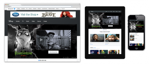
What do you think of the new Disney.com design? Don’t forget to leave us your thoughts in the comments.

